
Talkin’ Things is a deep-tech pioneer and a central manufacturer of custom, high-capacity RFID/NFC hardware tags. Operating at the forefront of the Internet of Things (IoT), the brand designs smart packaging solutions for global corporate giants (including Coca-Cola, McDonald’s, and Procter & Gamble). The primary product design challenge was entirely unique: transforming invisible hardware radio frequencies and multi-million-row engineering datasets into smooth, interactive mobile user experiences and high-level corporate analytic interfaces.
As the lead visual and interaction architect, my mission was to conceptualize and execute a dual-sided digital software layer. This required engineering a fast, error-free consumer mobile flow for physical product interaction and constructing a sophisticated B2B desktop command center capable of visualising live data streams, retail supply chains, and security threats.
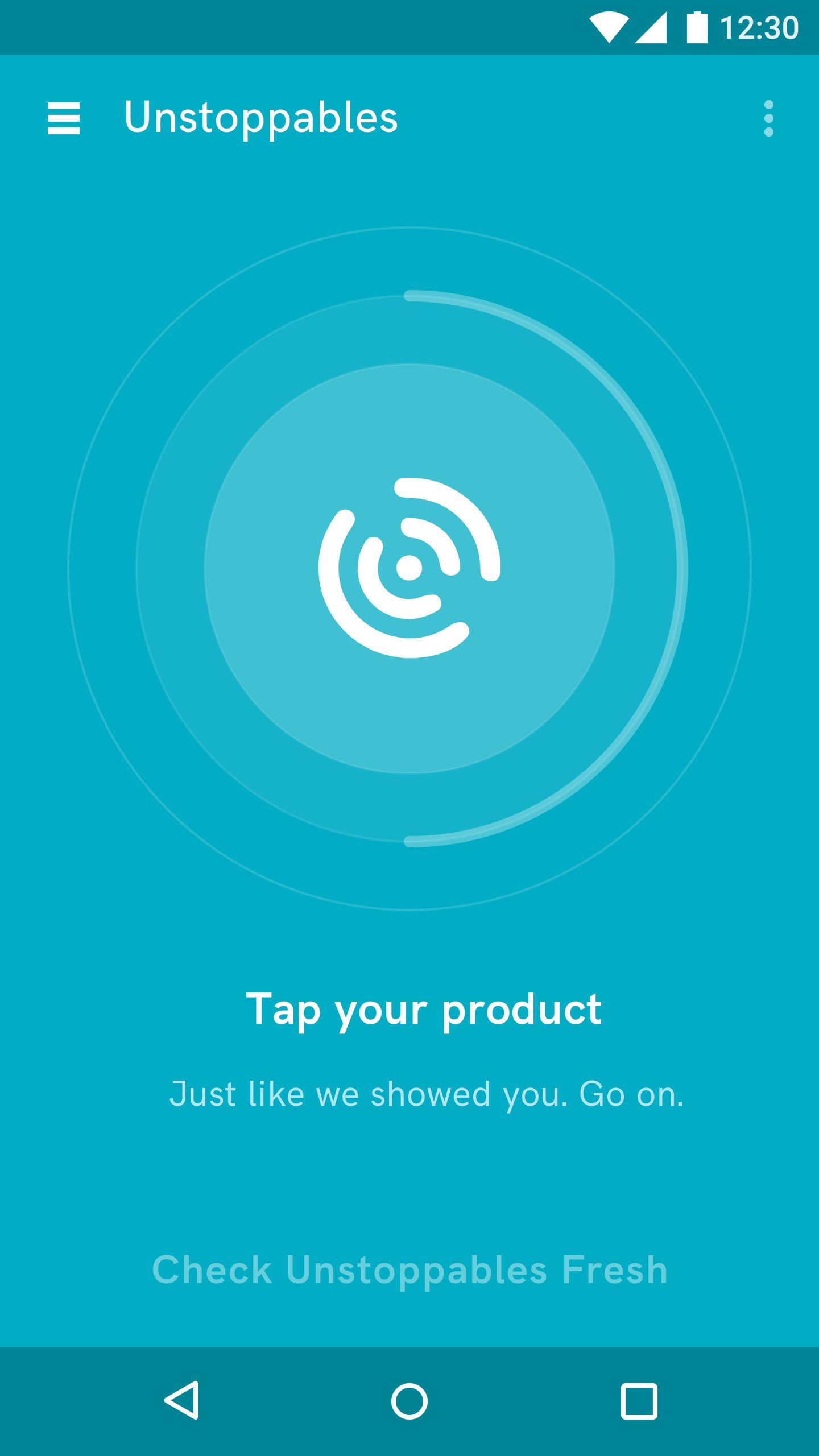
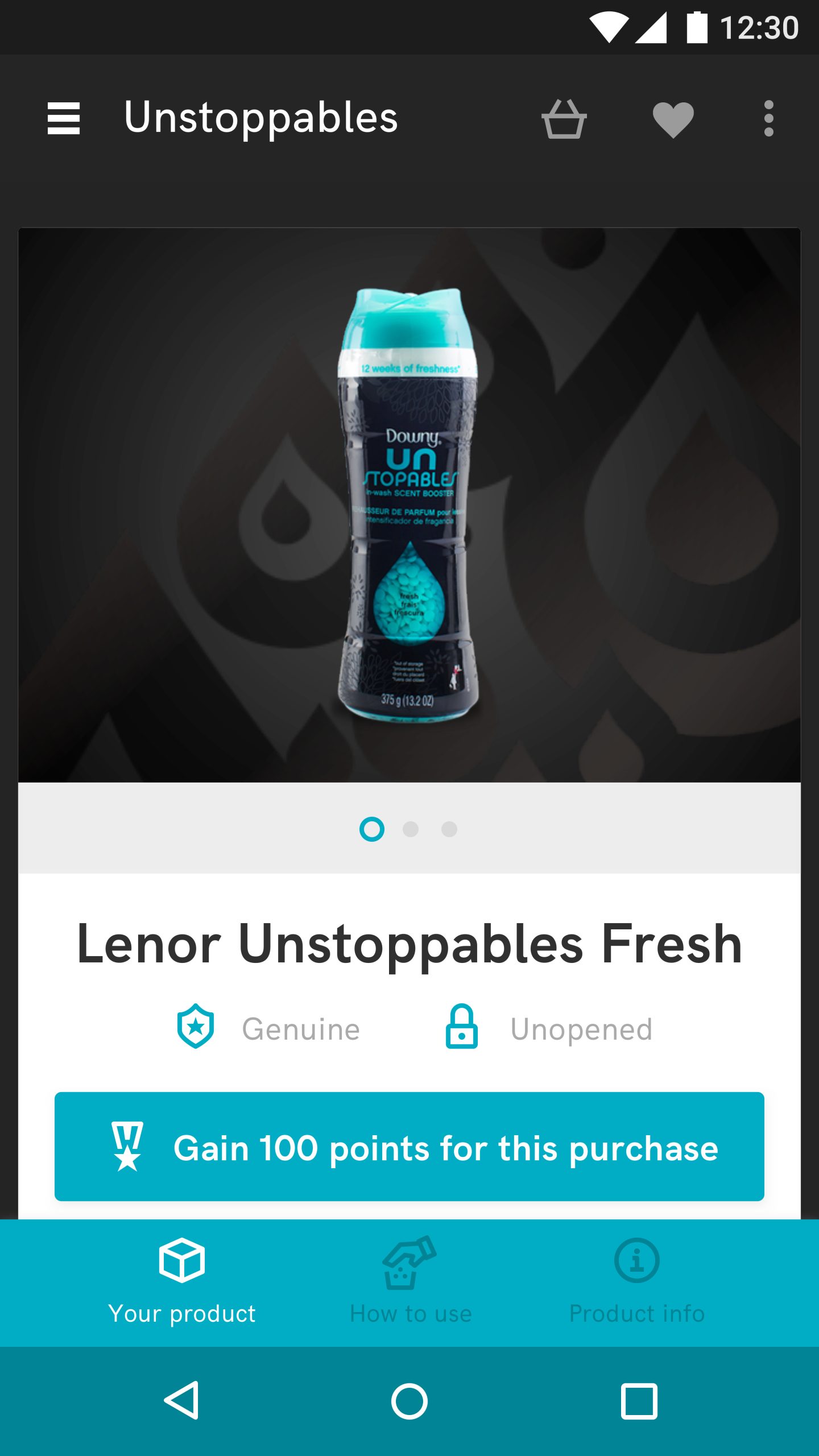
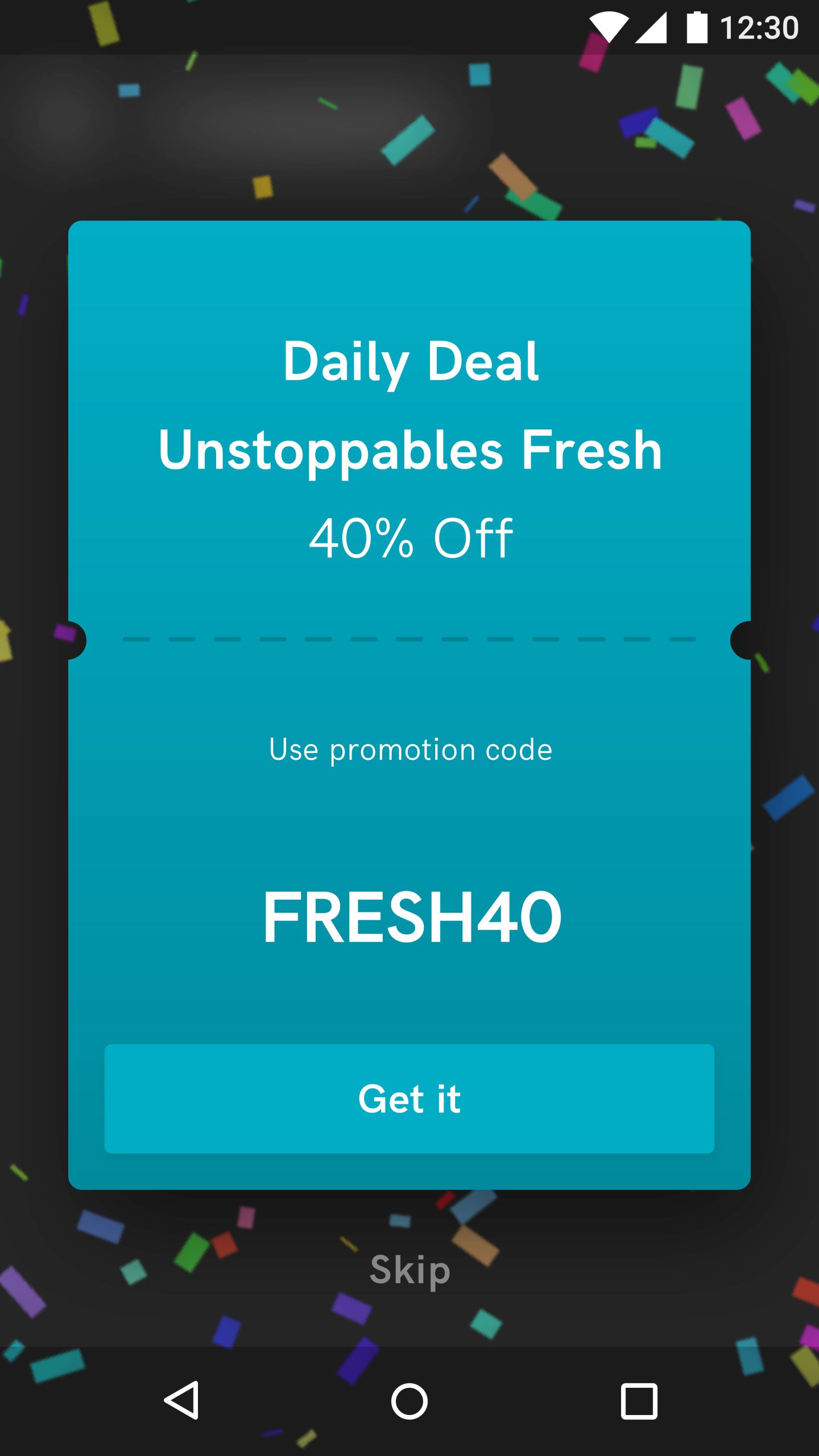
Designing software for physical objects requires shaping non-traditional human habits. Utilizing large-scale enterprise rollouts (Lenor Unstoppables and Joops) as operational foundations, I built a predictive 3-stage interactive user loop:
A mass scale IoT deployment produces millions of live tracking pings that are useless without instant visual clarity. I designed a high-end desktop dashboard that turns complex, multi-layered data into clear, actionable corporate strategy:
#CE0000). This allows enterprise brand managers to spot counterfeit operations or black-market leaking within seconds, completely eliminating data reading overhead.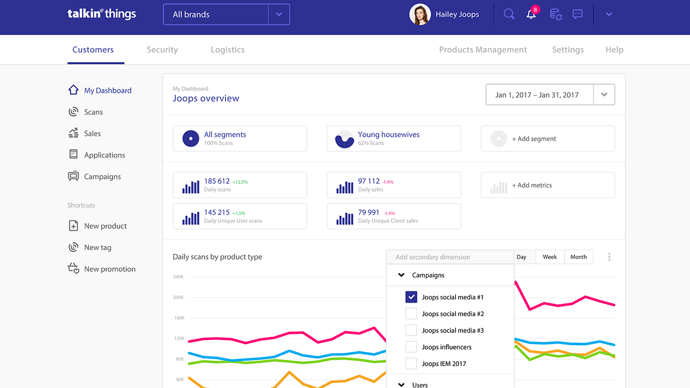
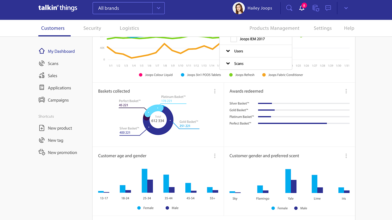
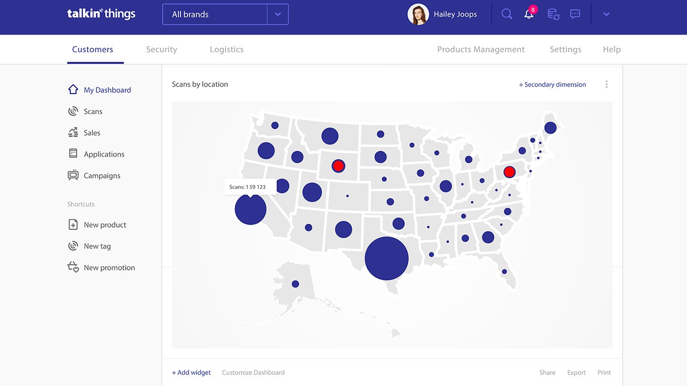
To prove the execution of these systems, the case study integrates strategic interactive media highlights showcasing my operational direction:
Hardware-Software Unification: Created a polished digital design system that made advanced, invisible hardware operations intuitive for everyday global consumers.
Enterprise-Grade Usability: Successfully demonstrated that big-data industrial telemetry can be synthesized into clean, hyper-usable mobile layouts and high-performance business dashboard software.
BRAND MY NAME is a boutique agency specializing in building personal brands and supporting small businesses in their marketing and communication efforts. In a market flooded with generic marketing consultants, the agency needed a corporate identity that reflects absolute professionalism, strategic depth, and high-end creative authority.
My task was to design a comprehensive visual identity system from the ground up. The primary objective was to create a bold, memorable logomark and cohesive branding assets that inspire trust in premium clients, while remaining versatile enough to adapt seamlessly across both physical print and digital media platforms.
The creative process began by defining the core message of the agency: clarity, precision, and authority. Leveraging my extensive background in marketing communication, I established a high-contrast, sophisticated visual direction. The branding needed to look minimal yet impactful, ensuring that the agency’s own visual presence frames their clients’ personal brands beautifully without causing visual clutter.
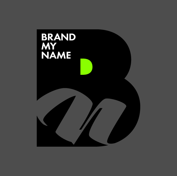
The naming “BRAND MY NAME” carries a strong imperative. The logomark needed to reflect this confidence:
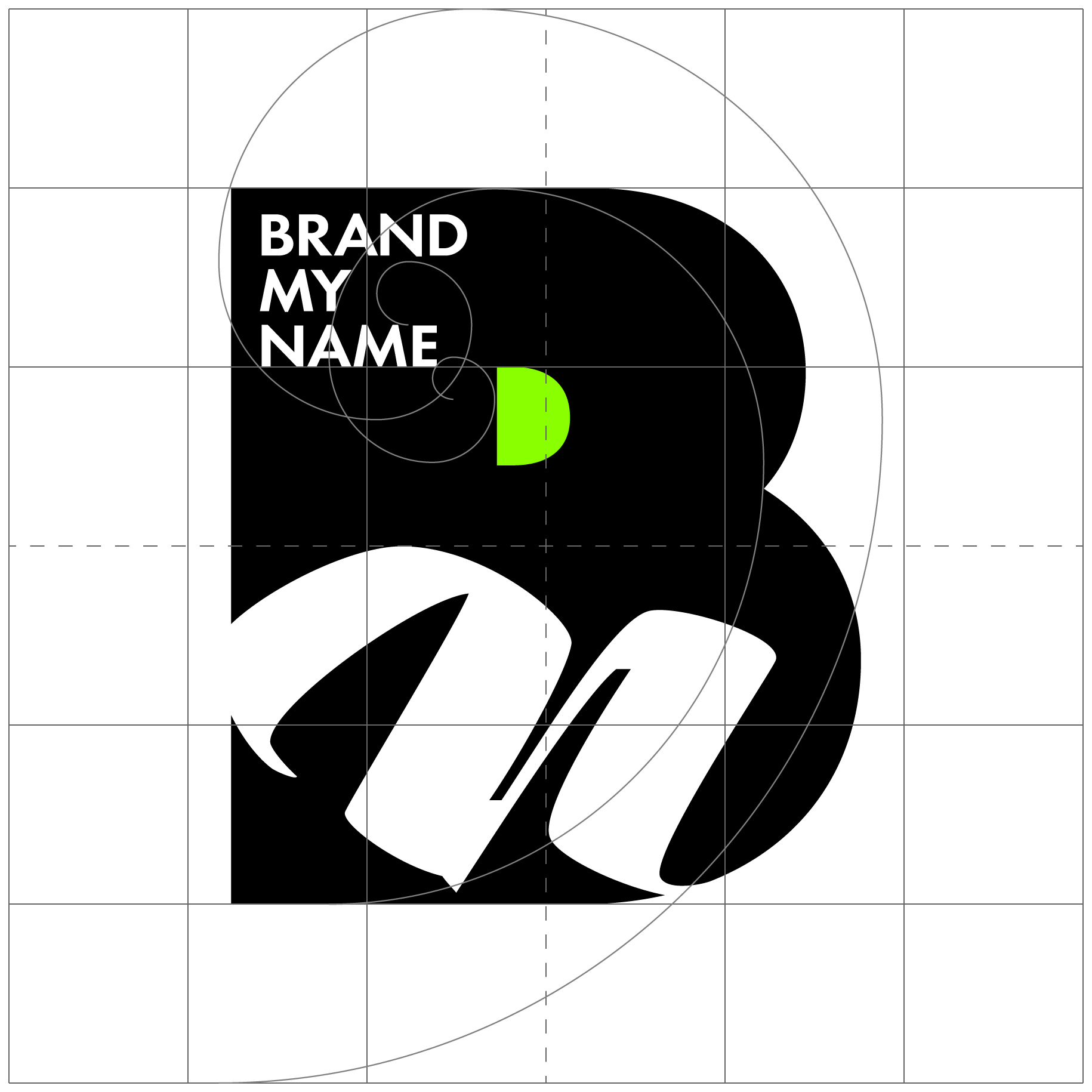
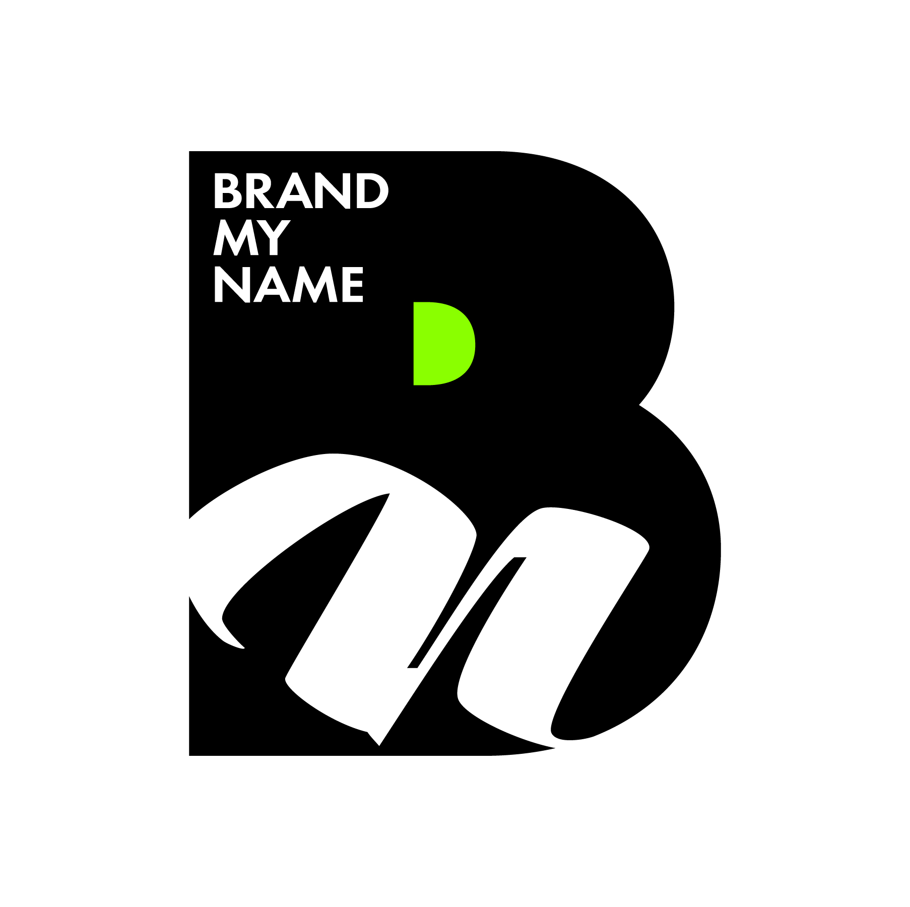
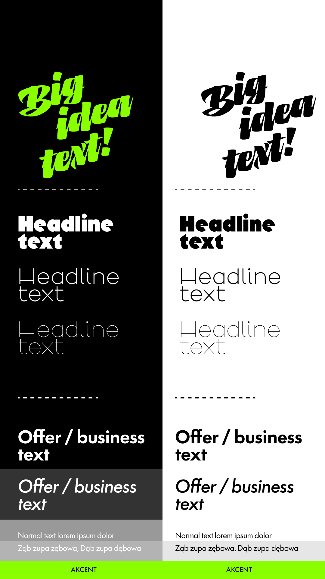
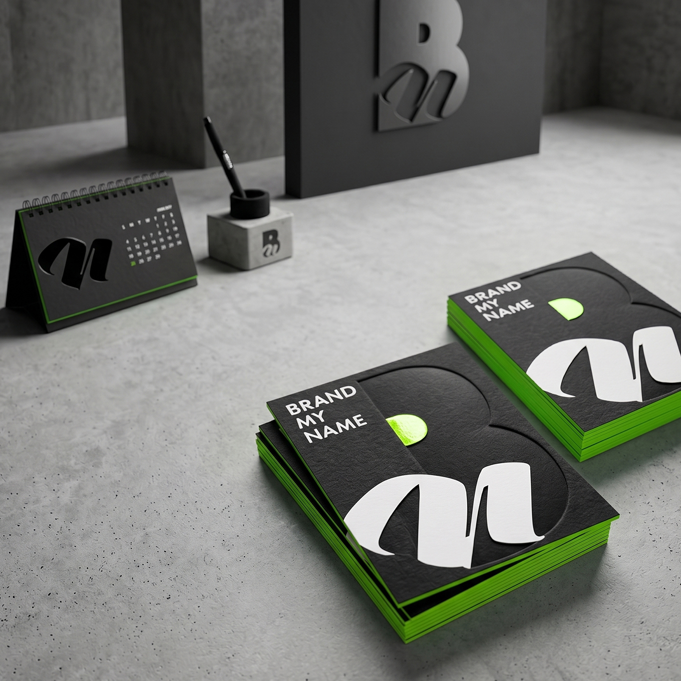
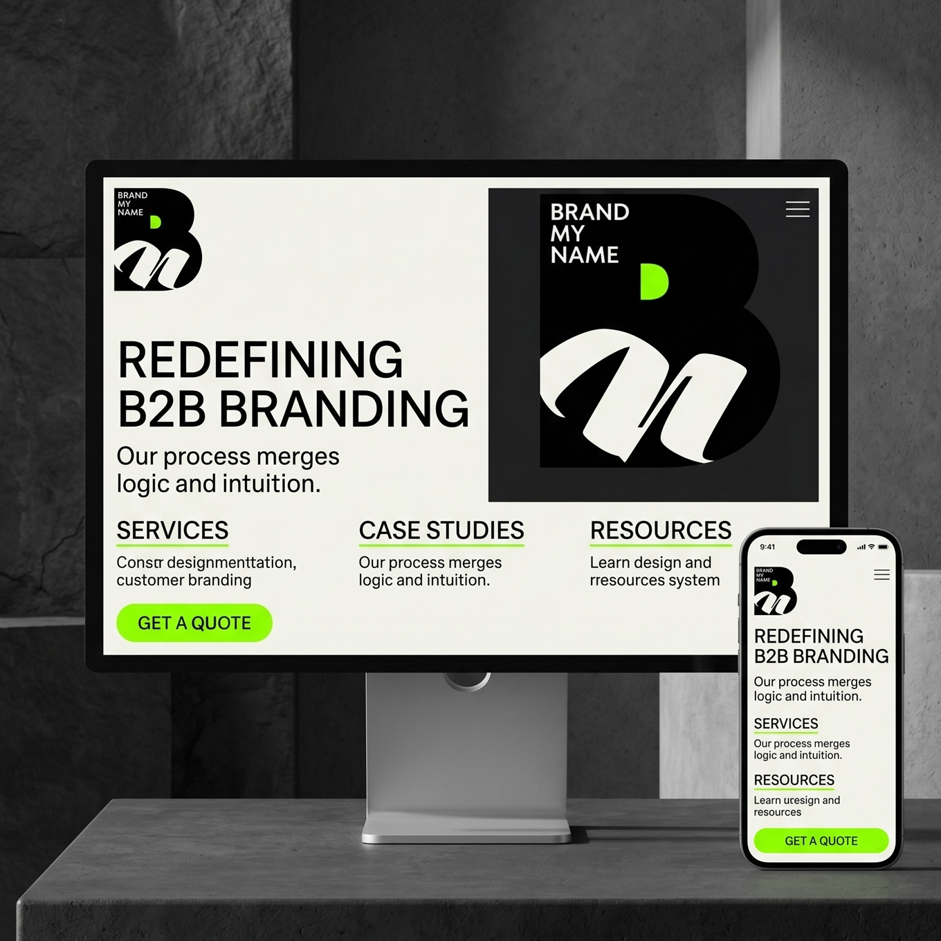
A brand agency must lead by example. I developed a unified design system that covers all touchpoints of the brand’s daily business operations:
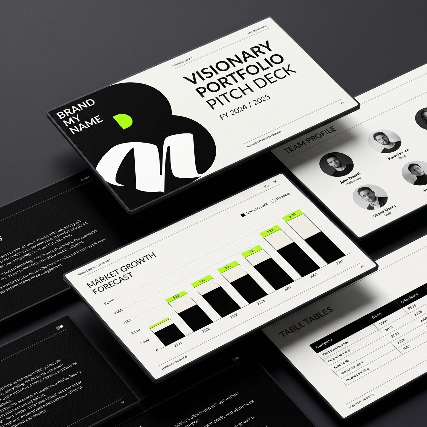
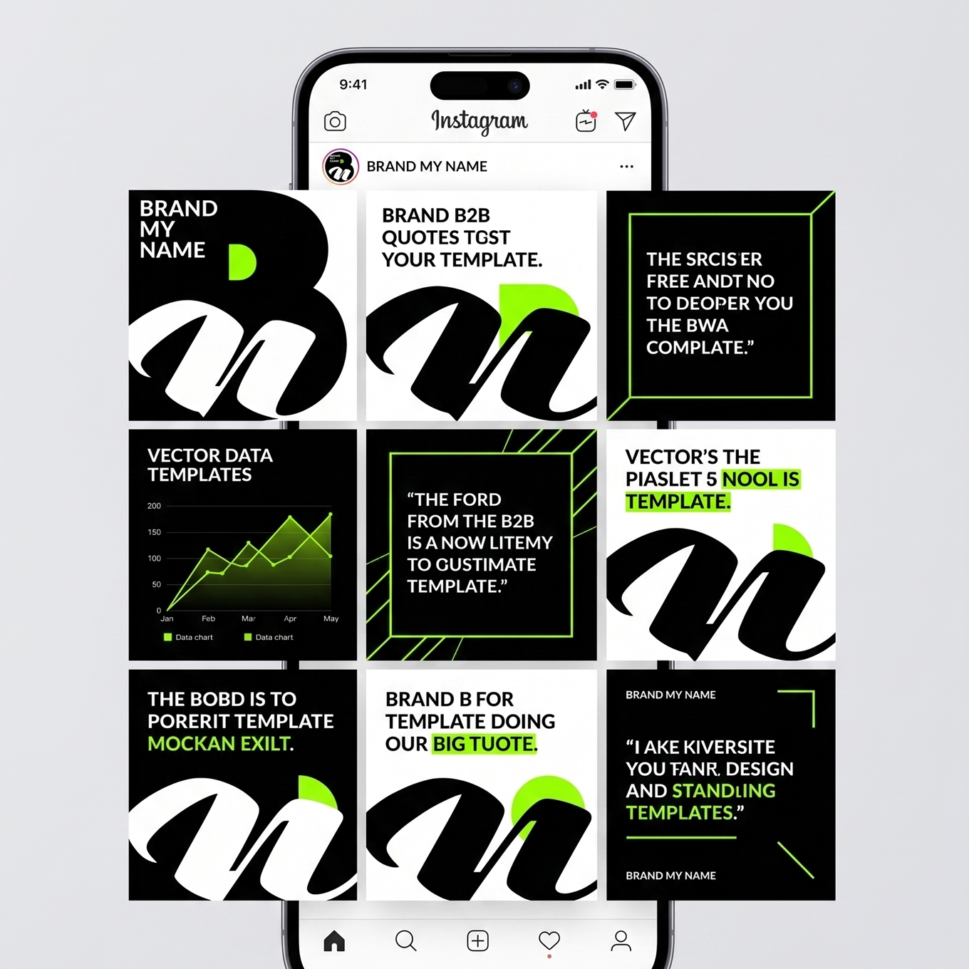
Cohesive Market Entry: Delivered a bulletproof corporate identity system that successfully positioned BRAND MY NAME as an elite player in the personal branding sector from day one.
Design Excellence: The project perfectly demonstrates my capability as an independent consultant to take a raw business concept and transform it into a sophisticated, cohesive, and market-ready visual reality.
The royal city of AlUla in Saudi Arabia is a cradle of ancient craftsmanship—from monumental facades carved into pink-gold sandstone to intricate geometric plasters in the Najdi style. The competition challenge was to interpret this year’s theme: “The Ingenuity of the Human Hand.”
The project had to clearly reference this historical context while maintaining complete originality, freshness, and ecological as well as technical feasibility. The objective was to create a motif that bridges AlUla’s deep past with innovative visions of tomorrow, suitable for scaling across 3D printing, architecture, and contemporary fashion.
The creative process began by defining the core message of the agency: clarity, precision, and authority. Leveraging my extensive background in marketing communication, I established a high-contrast, sophisticated visual direction. The branding needed to look minimal yet impactful, ensuring that the agency’s own visual presence frames their clients’ personal brands beautifully without causing visual clutter.
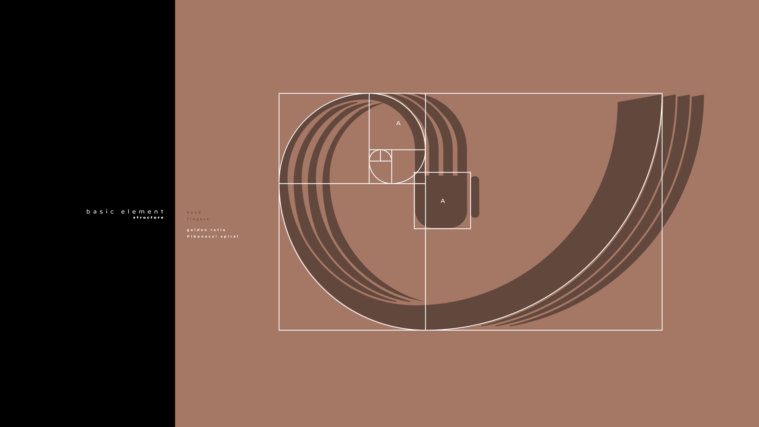
To imbue the project with timeless harmony, the fundamental component (the strand representing a human finger/gesture) was drafted based on the Golden Ratio and the Fibonacci spiral (as shown in the construction blueprint). This approach ensures that the organic movement of the human hand acquires structural discipline.
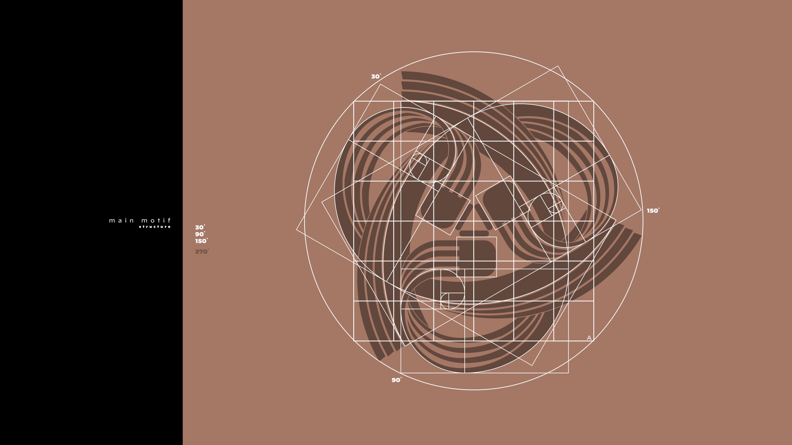
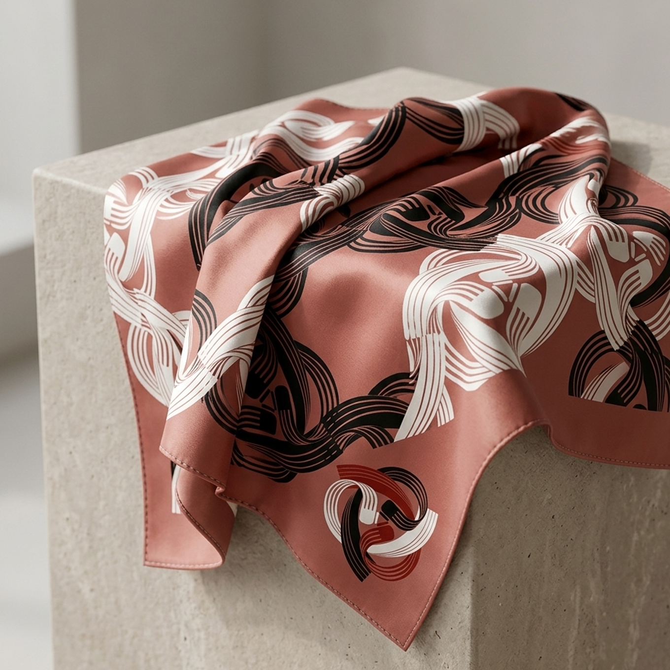
Three optimized strands were combined into a central rosette (triquetra) using a rigorous radial grid based on angles of 30°, 90°, 150°, and 270° (visible in the motif structure diagram). This construction guarantees ideal visual balance. I prepared three color variants of the main motif, tailored for diverse mediums:
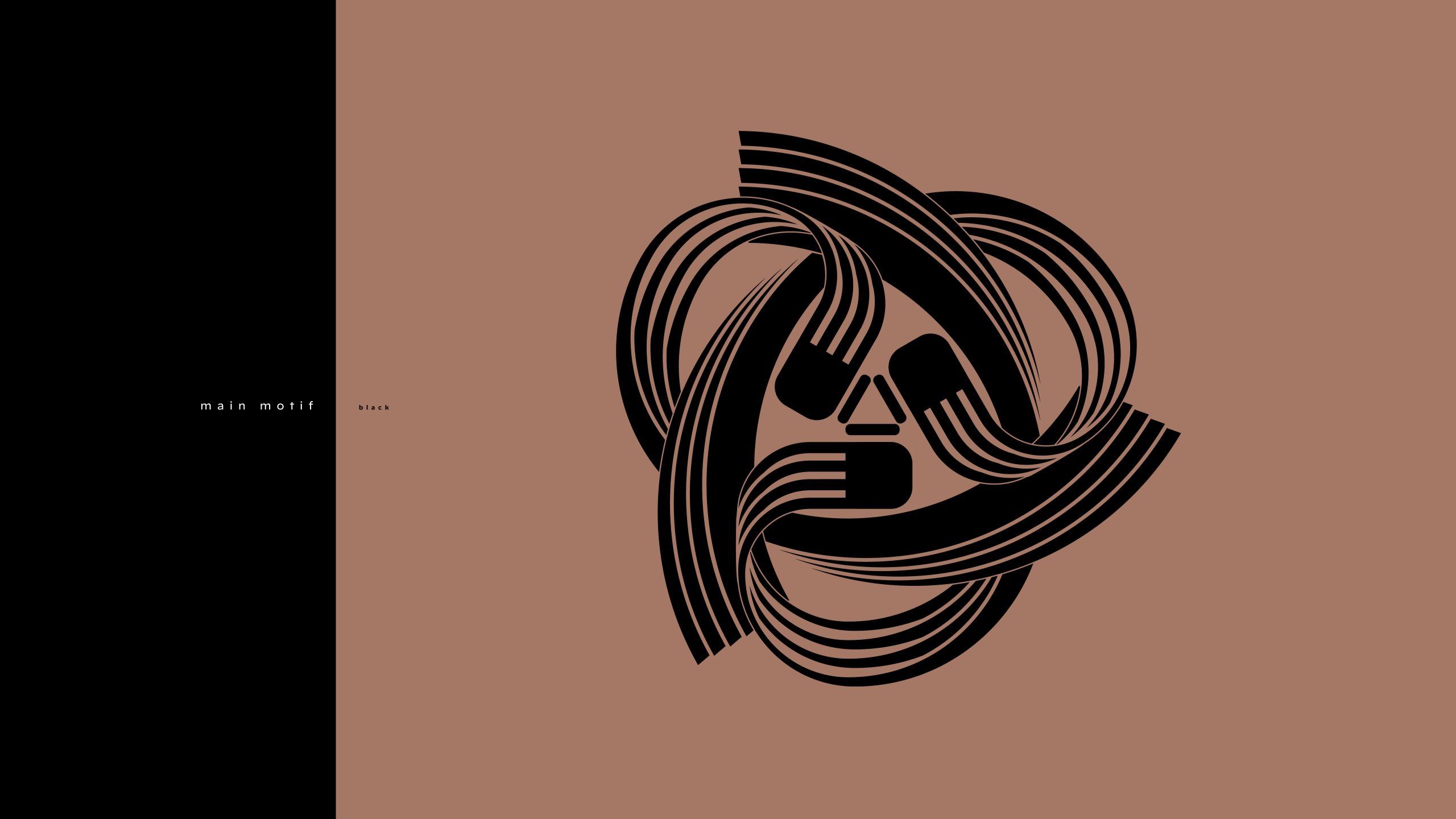
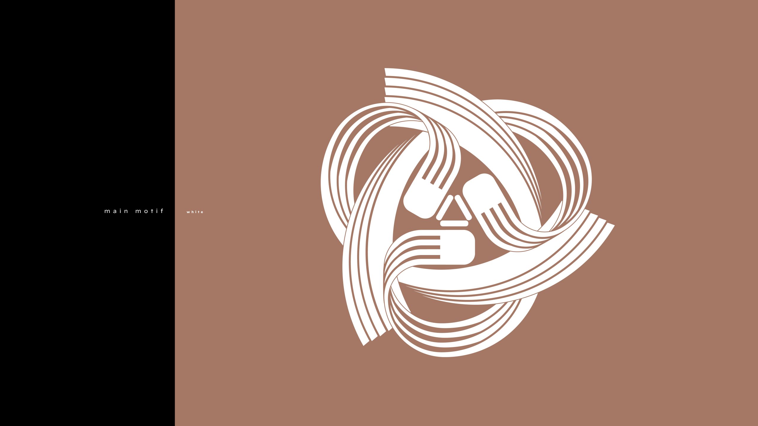
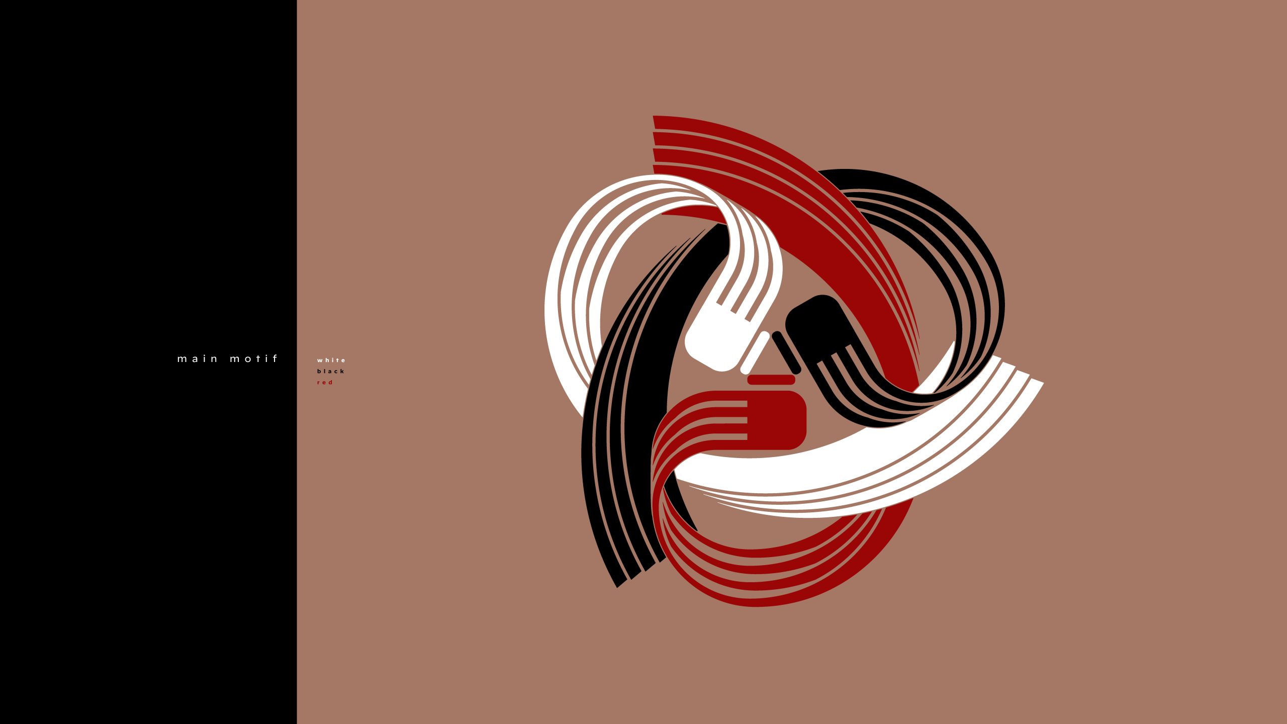
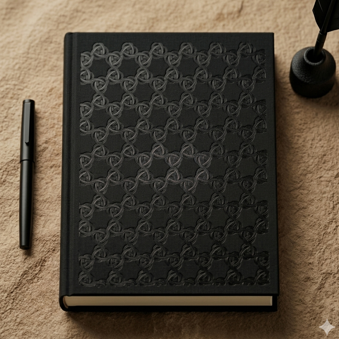
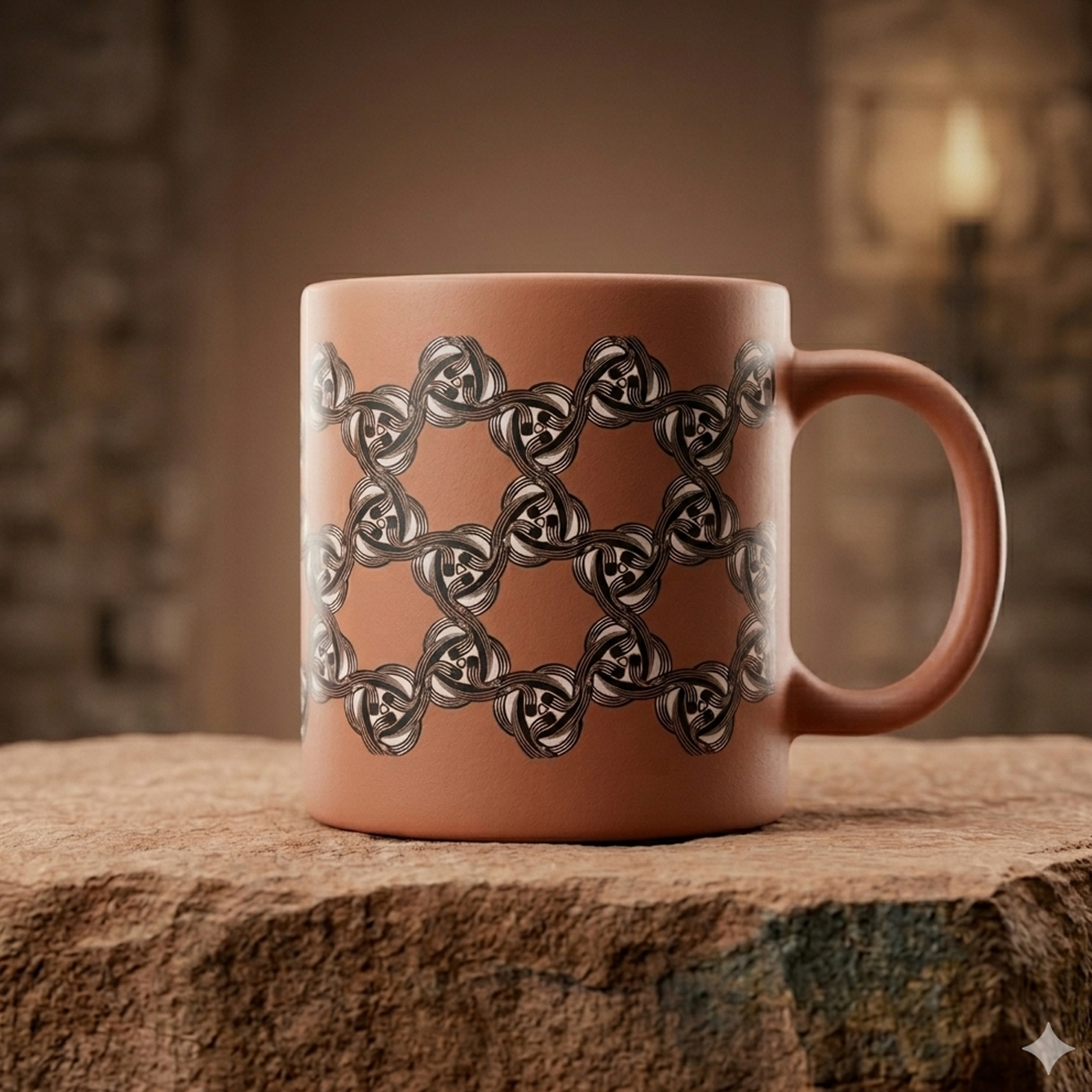
In line with the technical requirements and the need for scalability, the central motif was expanded into four advanced ornamental structure options:
As a result, the ornament ceased to be merely decorative and became a carrier of structural information, ready for implementation using modern tools such as 3D printing.
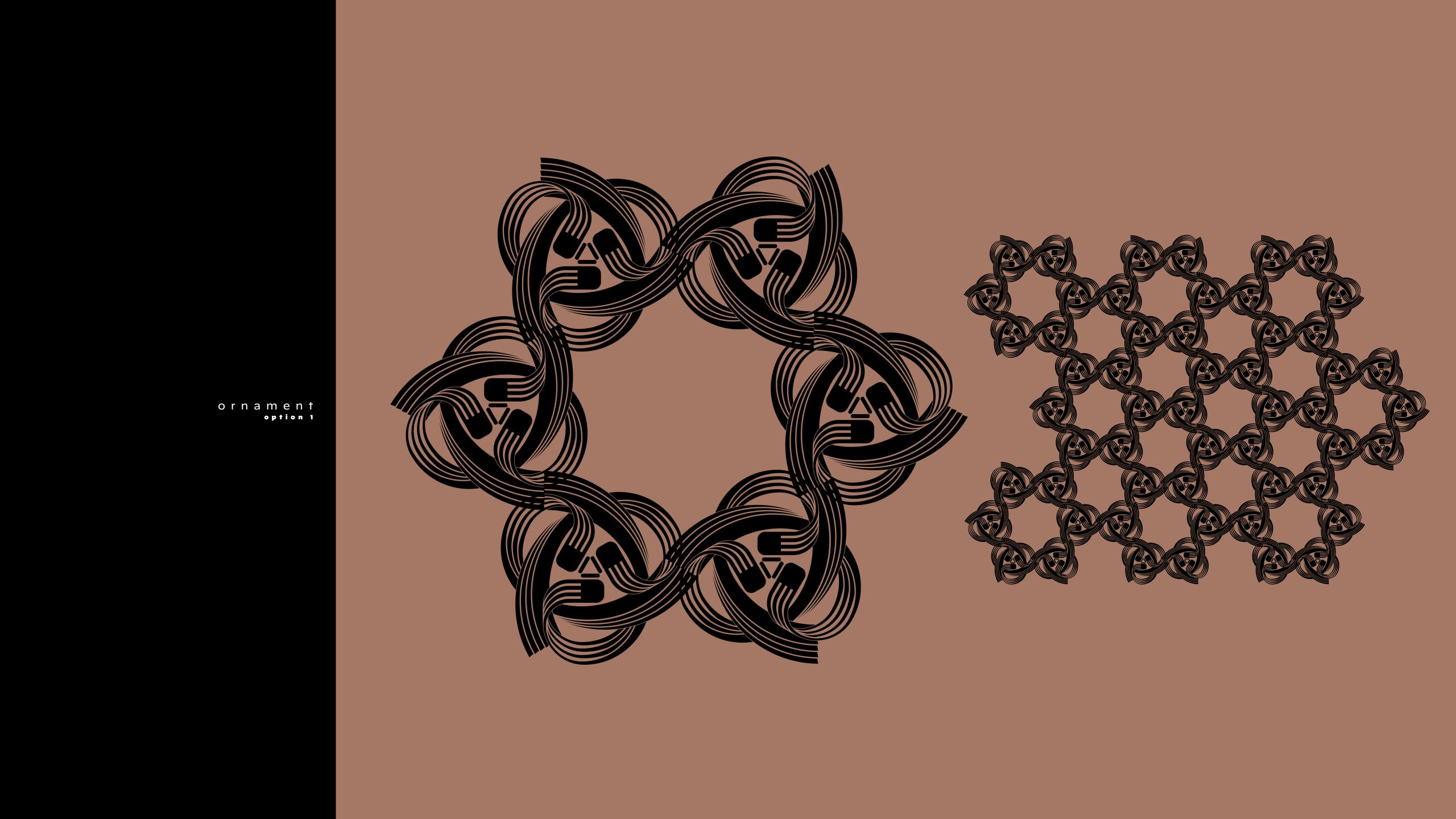
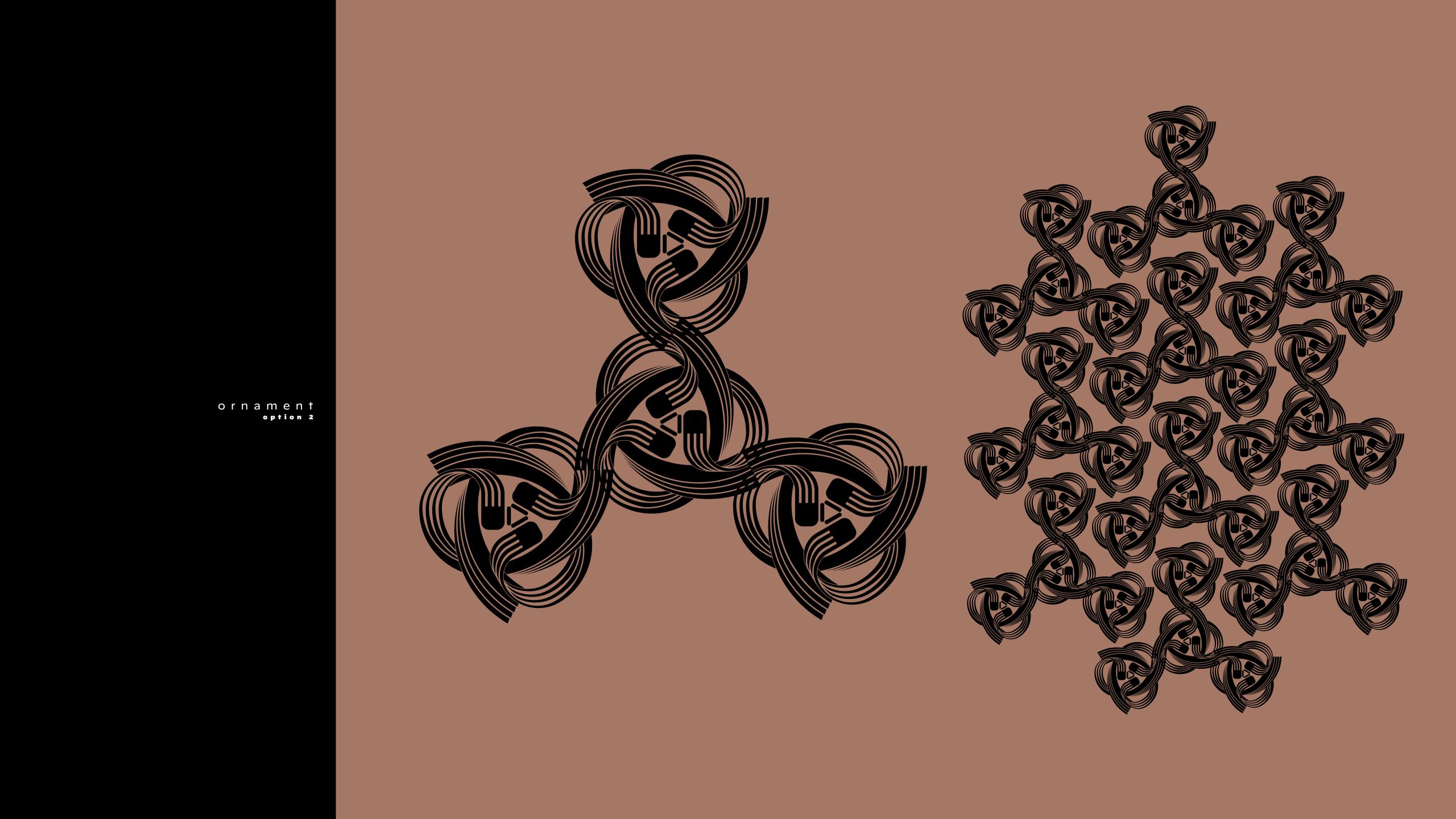
As a result, the ornament ceased to be merely decorative and became a carrier of structural information, ready for implementation using modern tools such as 3D printing.
The furniture restoration market is growing rapidly, but most brands focus strictly on classic, historical restoration. Człowiek z Komodo carved out a unique niche: upcycling mid-century vintage furniture and giving it a second life through bold, modern hand-painted patterns inspired by Op’Art.
As Art Director and Brand Designer, my role was not to restore the furniture or design the patterns myself, but to transform this unique craftsmanship into a distinct, functional, and modern digital brand. The business objective was to build a comprehensive visual identity and an intuitive e-commerce platform that positions these niche items as premium pieces of collectible functional art, thereby attracting design enthusiasts and art collectors.
The project began by defining the brand’s archetype and translating a hands-on workshop concept into a digital business strategy. Combining my fine arts background (Academy of Fine Arts in Warsaw) with a strategic marketing approach allowed me to establish a visual framework that perfectly showcases the unique furniture without overpowering its inherent character.
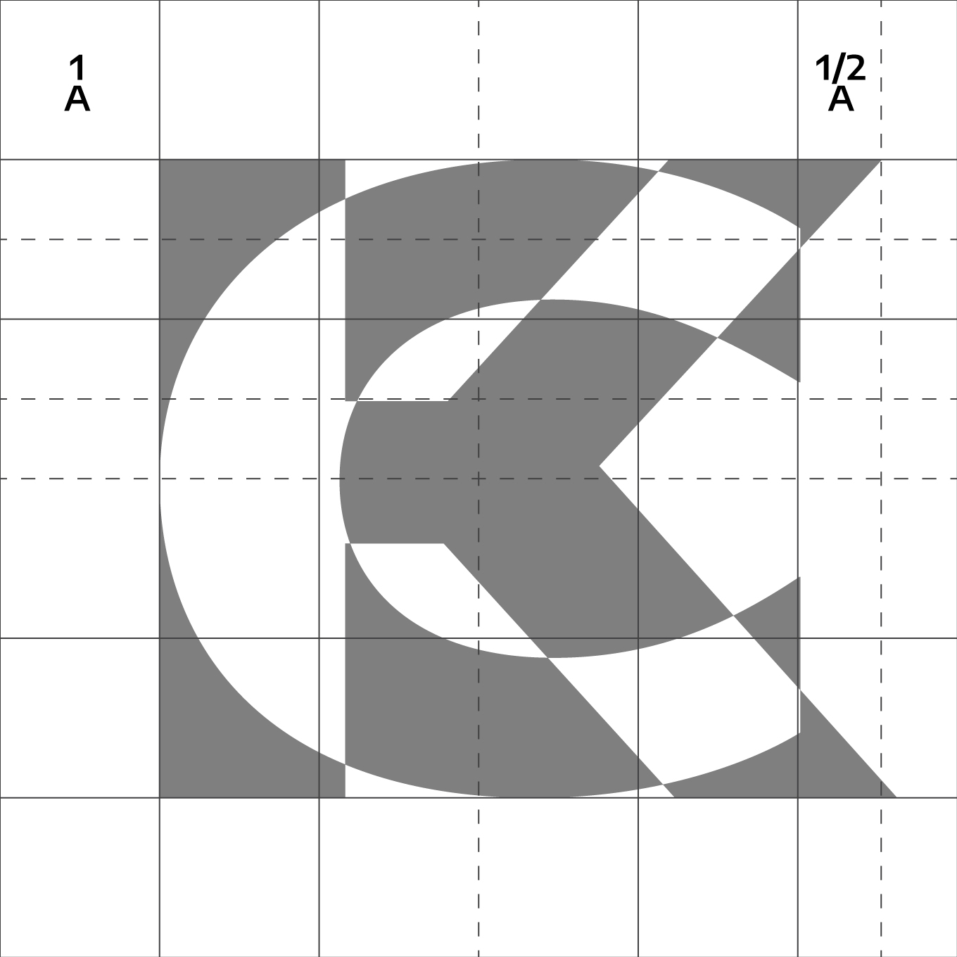
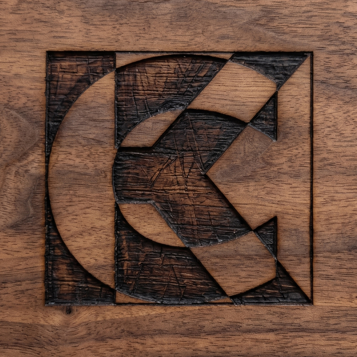
Designing the mark required a precise balance between the raw, tactile nature of woodworking and the mathematical geometry of Op’Art. The logo needed to be highly versatile:


I designed the user interface (UI) for the e-commerce store using WordPress, establishing a minimalist, high-contrast aesthetic that lets the product imagery take center stage.
I was responsible for the visual direction and management of the brand’s social media channels (Instagram, Facebook). I produced engaging video content (Instagram Reels, short-form process videos made with After Effects) that pulled back the curtain on the studio’s workflow. High-contrast “before/after” formats built immediate authenticity and drove organic e-commerce traffic and sales.
Full-Scale Brand Launch: Successfully guided the brand through its entire foundational lifecycle—from the very first pencil sketch of the logo, through packaging and certificate design, to a fully operational e-commerce ecosystem.
Business Maturity: This project proved my ability to manage a comprehensive creative process where high-end graphic design and UI function directly as business tools to drive digital sales for a physical, premium product.