

Deep-tech enterprises operating in the Internet of Things (IoT) sector face a distinct brand identity challenge: their core product is invisible hardware technology (radio frequencies, microchips, data packets). Talkin’ Things, as an industrial leader supplying global corporations, required a corporate identity system (Brand Book) that translates complex hardware engineering into a highly scalable, authoritative, and sophisticated visual language.
The objective was to codify an absolute design framework-spanning from mathematical logotype margins to contextual cross-platform typography-ensuring flawless brand consistency across corporate stationery, physical high-volume product packaging, and high-performance digital interfaces.
To secure visual authority and prevent layout clutter across industrial mediums, the corporate logotype was bound to a strict mathematical grid system:
To optimize readability across radically different communication channels, the brand book establishes a dual-front font hierarchy, matching typography to specific user environments:
Color within the tech space must perform a functional role rather than an aesthetic one. The palette is divided into two operational tiers:
#001446): The foundational corporate brand tone, anchoring background cards, navigation headers, and primary solid blocks. Its gradient variant “45º” orientation shifting to #1A2850) handles decorative UI backgrounds and iconography.#0098DE): The active accent tone applied to lines, focus items, and distinct interactive elements. Its gradient pair “45º” orientation shifting to #00C9F1) is reserved for high-priority interactive components and primary action buttons.#000000 / #111111): Utilized exclusively for primary text layers, heavy editorial headlines, and structural wireframe elements where absolute contrast against light backdrops is necessary.#B6B8B4 / #EAEAEA): Light Grey handles inactive system components or less critical labels, while Extra Light Grey serves as the baseline card and form background to group information without creating visual noise.Enterprise Framework Unification: Transformed an irregular deep-tech aesthetic into a pristine, systematic Corporate Identity (CI) blueprint easily adopted by external developers and global industrial printing houses.
Operational Scalability: Proved that complex data architectures, corporate presentations, and small-scale mobile application UIs can share a single, harmonized visual DNA.
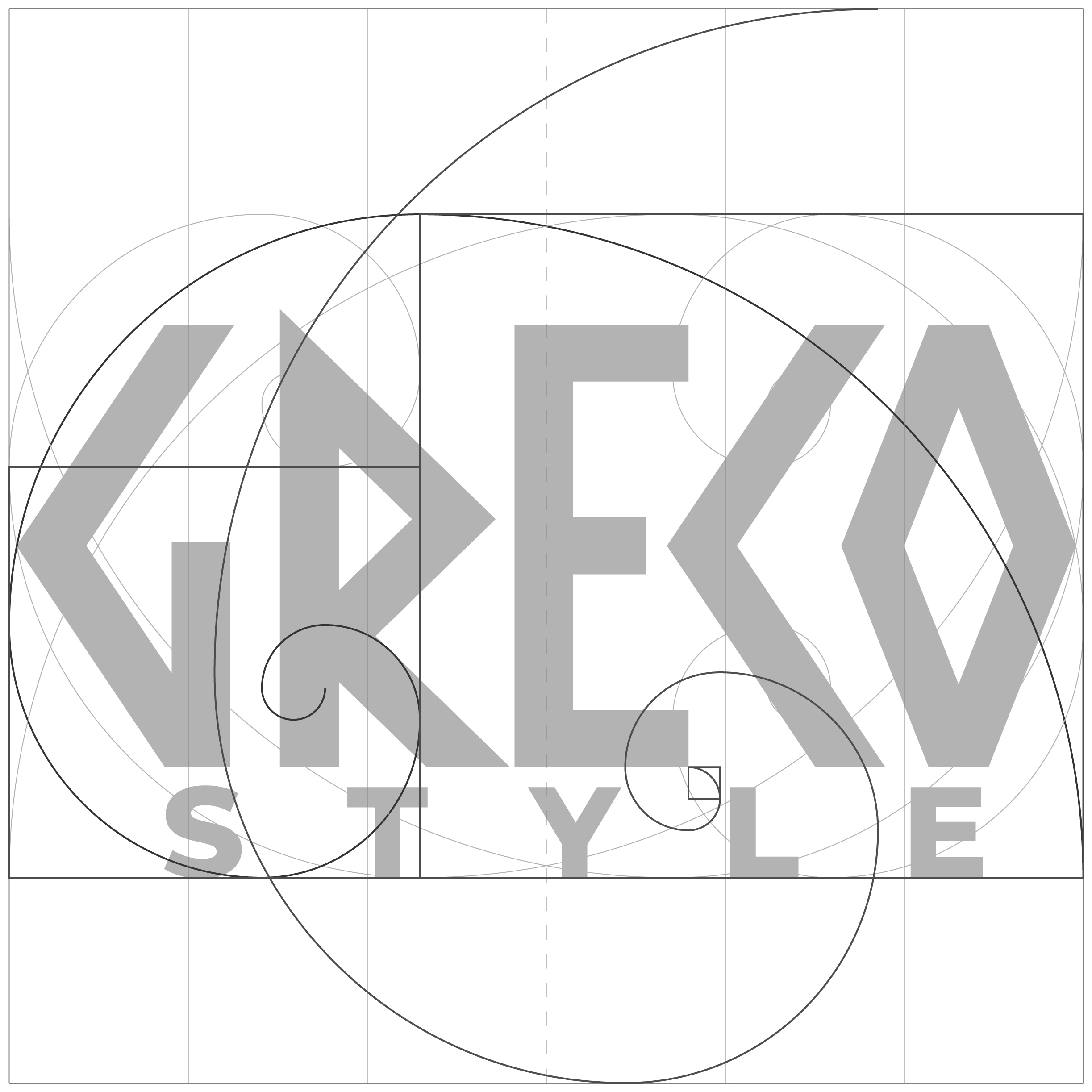
GrEco Style is an authentic boutique brand and importer specializing in premium Greek delicatessen and natural cosmetics—bringing the finest artisanal products directly from Greek soil to Polish homes. Operating two active brick-and-mortar retail hubs in Warsaw , the brand faces a highly competitive gourmet food market.
The challenge was to take the core identity and expand it into a comprehensive, high-end branding system. The identity needed to break away from generic, cliché Mediterranean green motifs, instead shifting toward an authentic, premium aesthetic that guarantees shelf-standing visibility across diverse product lines (gourmet foods, olive oils, and natural cosmetics) and physical retail storefronts.
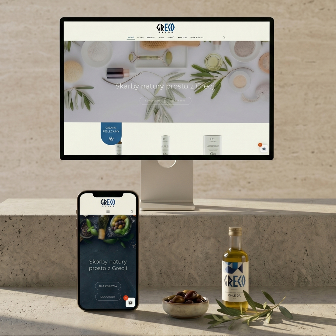
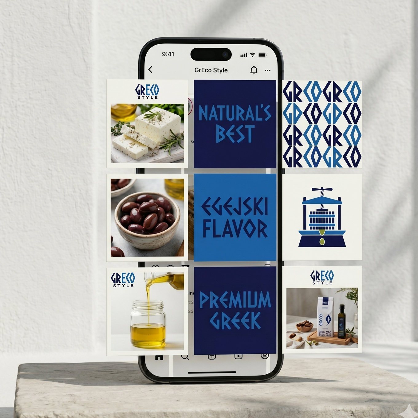
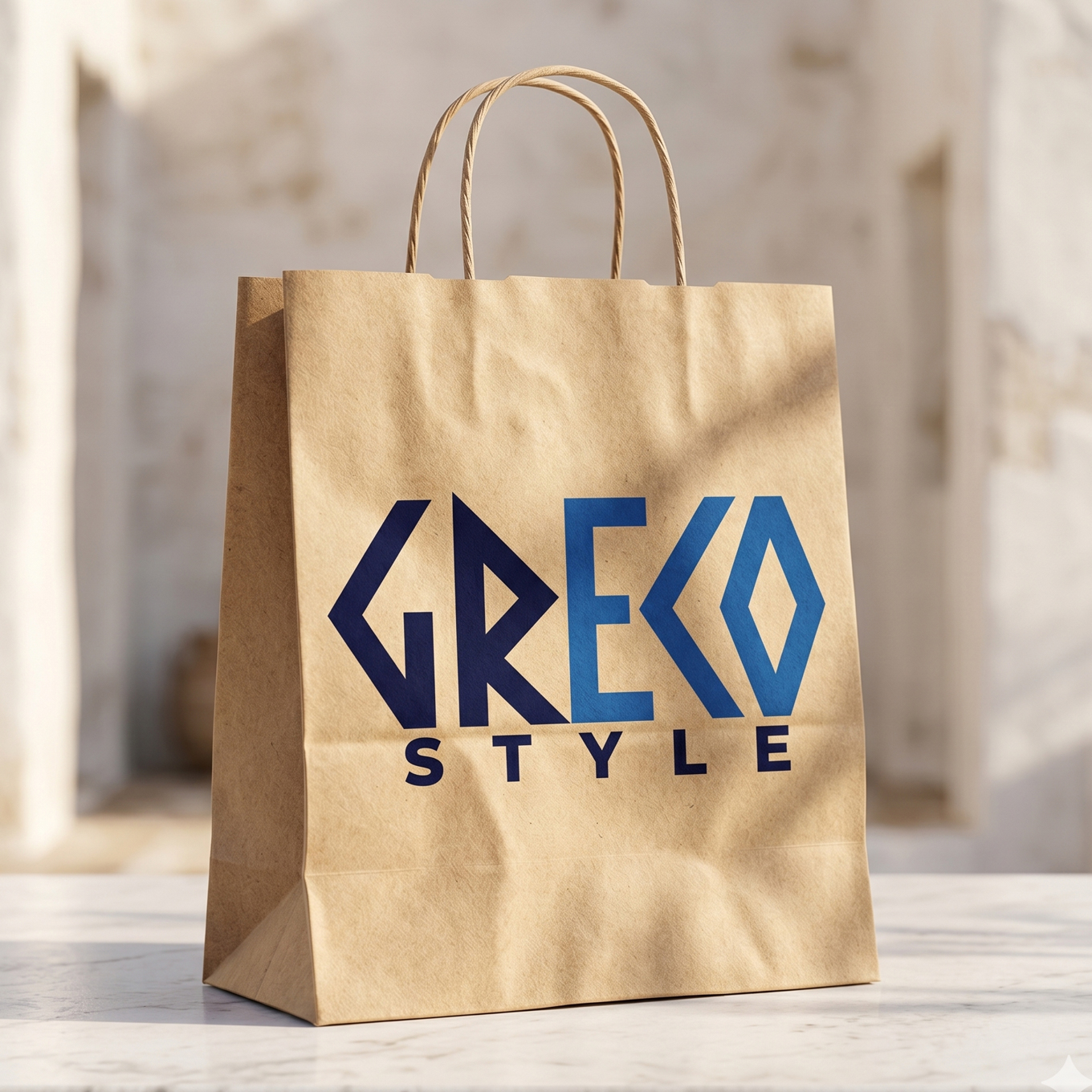
Elevated Visual Authority: Transformed a local retail importer into a high-end, cohesive Mediterranean lifestyle brand with a solid, premium identity system.
Design Excellence: The inclusion of the structural grid blueprint demonstrates a master-level command of vector geometry, proving that the identity is built to scale across any physical or digital medium without losing its technical precision.
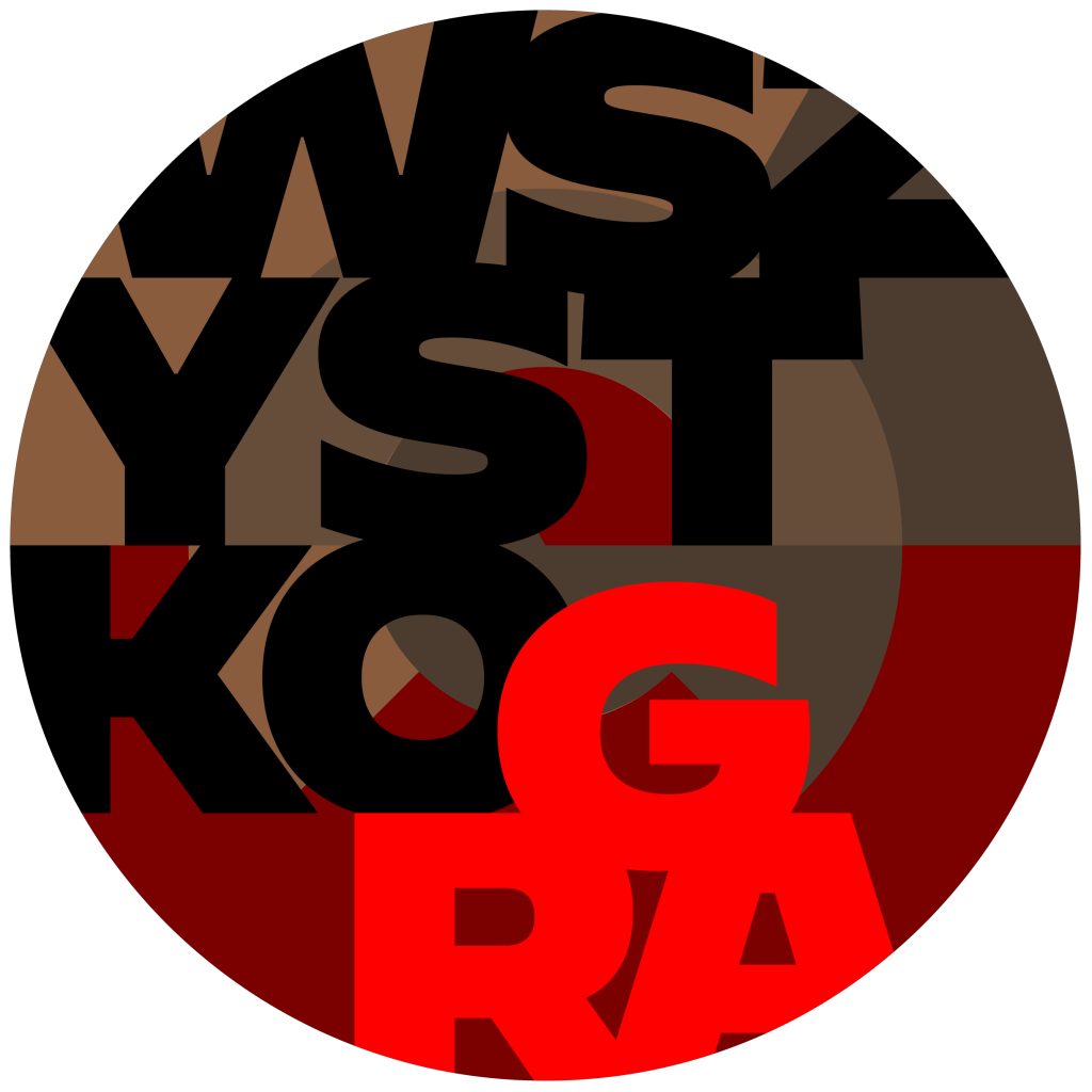
wszystkogra.pl is an authentic Polish artisan workshop that has been handcrafting traditional musical instruments—such as shamanic drums, bass drums, djembe, and acoustic toys—for over 30 years. Operating at the intersection of musical heritage and acoustic therapy, the brand needed a powerful corporate mark. The challenge was to move away from chaotic folk clichés and design an elite, highly structured emblem that honors the raw, organic materials of the craft while reflecting absolute mathematical and structural perfection.
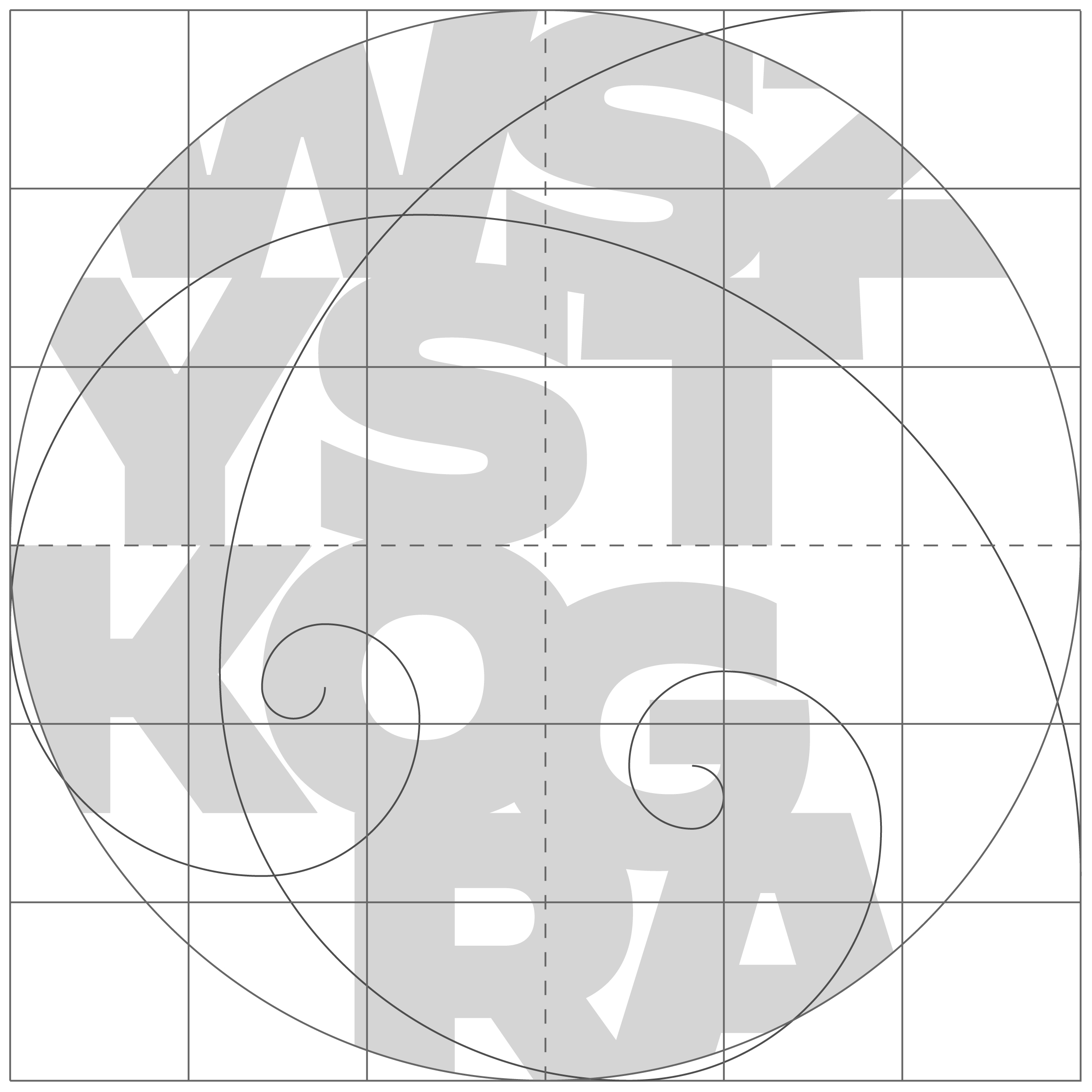
To create a mark worthy of a master craftsman, I designed an architectural emblem bounded by a perfect circle. The entire typographic and symbolic composition was built using a rigorous four-phase design process based on mathematical rhythm and organic decomposition:
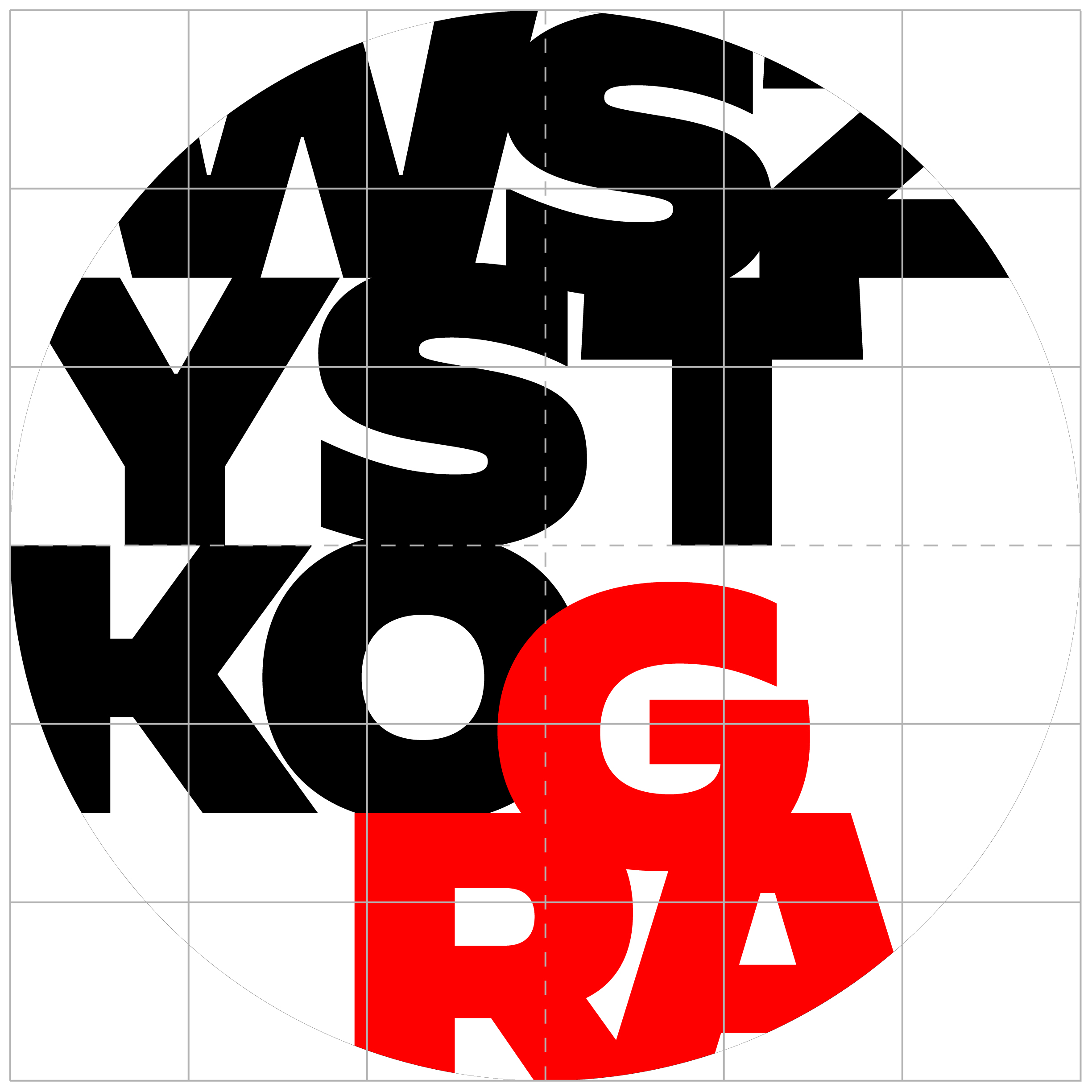
The process began by breaking down the brand name “WSZYSTKOGRA” into a multi-layered typographic block, tightly constrained within a precise square grid. The characters are heavily stylized with bold, rhythmic, and geometric sans-serif line-weights that mimic the steady, primeval beat of a drum. To ensure natural harmony, the typographic layout was mapped directly against a dual Fibonacci spiral (Golden Ratio), ensuring that the visual weight of the letters scales organically from the core outward.
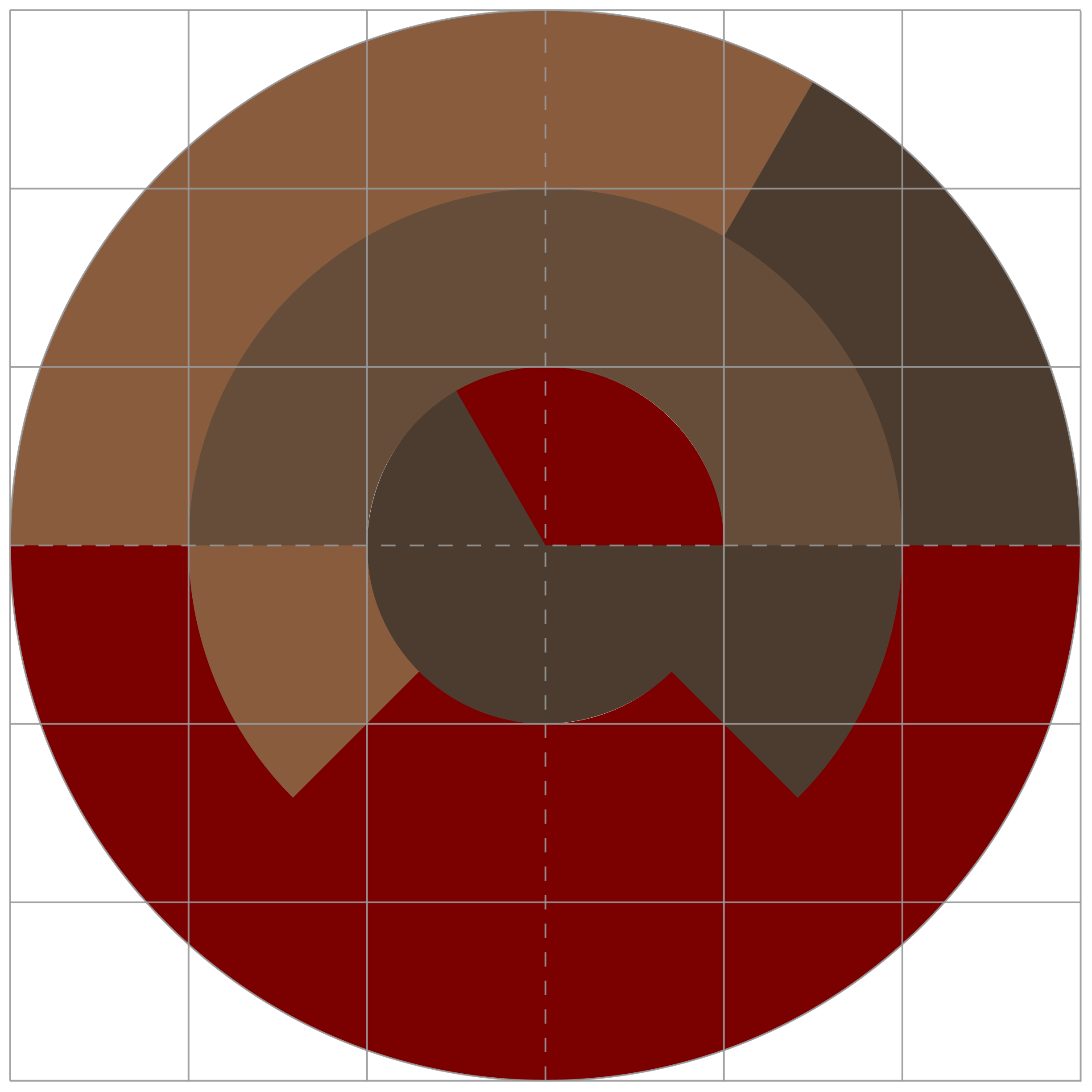
In this phase, the underlying structure of the circle was mathematically divided into radial and concentric sound-wave arcs, creating distinct physical zones. Each sector was assigned a specific corporate tone directly rooted in the organic raw materials used in the atelier:
This phase represents the intersection of the first two layers. The corporate typography was overlaid onto the mathematical color segments. The letters “WSZYSTKO” remain anchored in absolute matte black, establishing baseline structural trust. In contrast, the action word “GRA” (Polish for plays/resonates) is completely saturated in the vibrant crimson red, breaking out of the lower hemisphere to signify movement, vibration, and performance
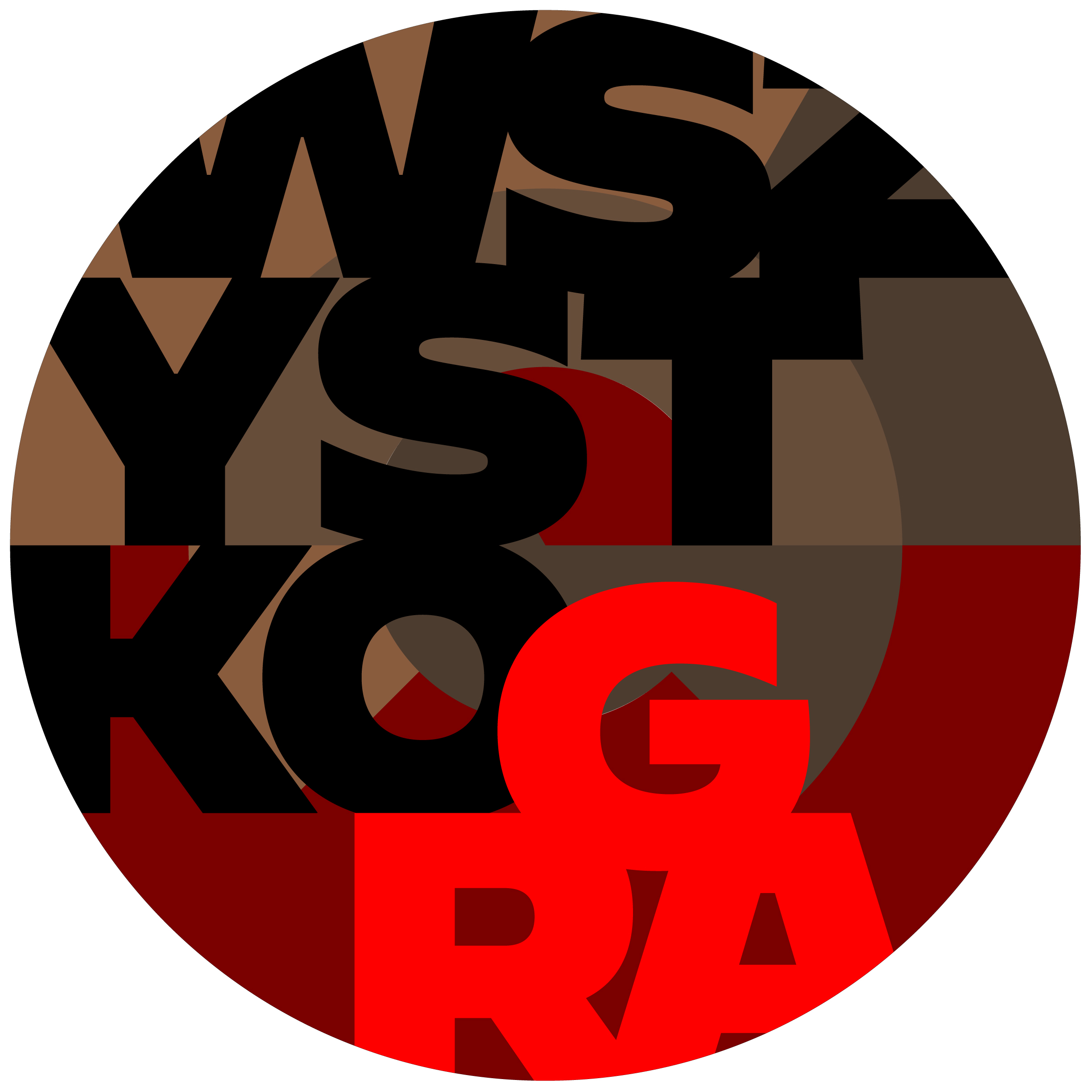
The final phase achieves complete aesthetic synthesis. The typographic contours, the mathematical grid, and the organic color sectors fuse into a singular, iconic emblem. The borders between text and background blend, turning the emblem into a highly complex, yet perfectly readable seal that represents a stylized drum membrane under tension.
Iconic Repositioning: Transformed a traditional 30-year-old workshop into an elite, culturally rich brand driven by structural discipline and sacred design.
Technical Mastery: The four-phase blueprint provides undeniable proof of senior-level design execution, showing how raw inspiration can be guided by flawless mathematical precision.
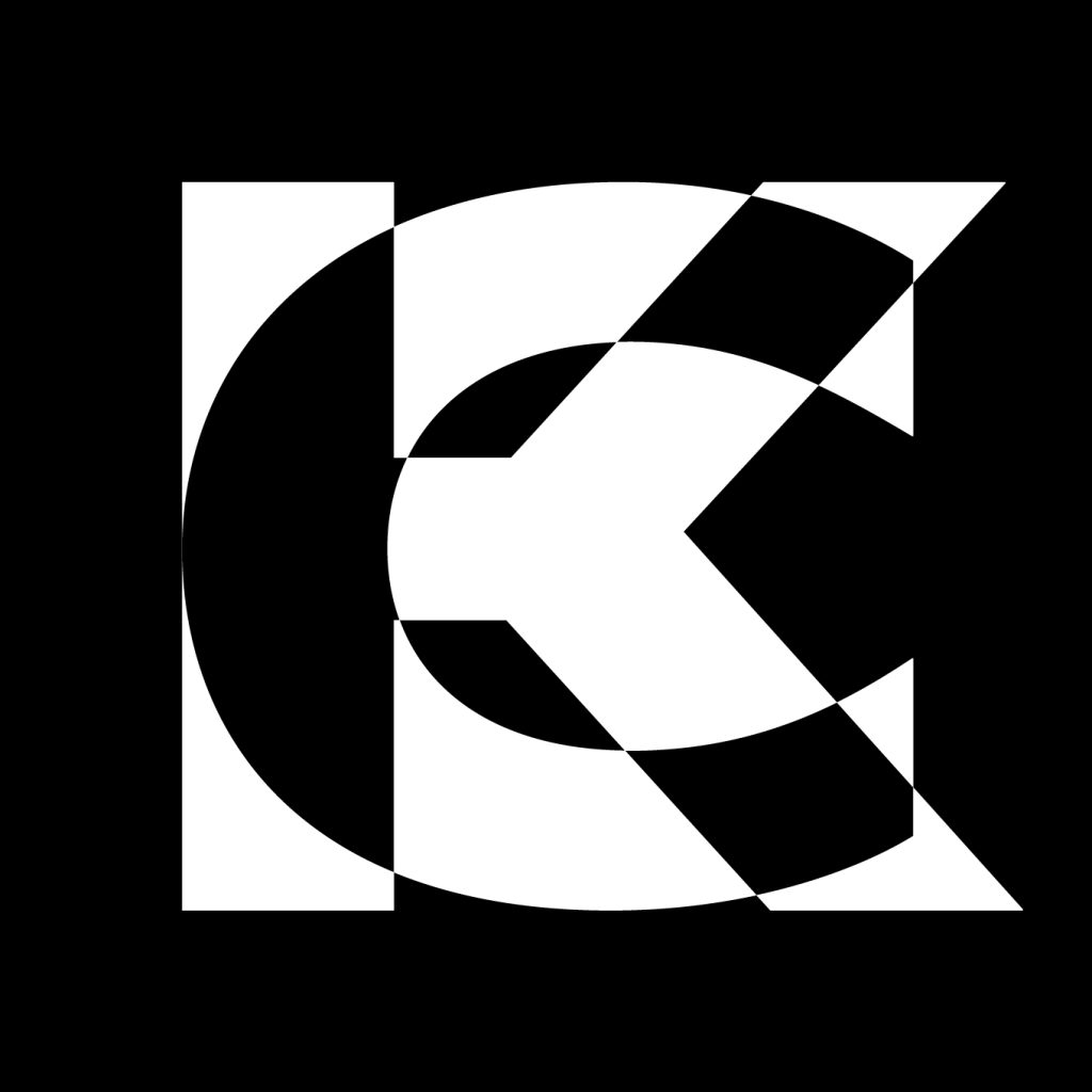
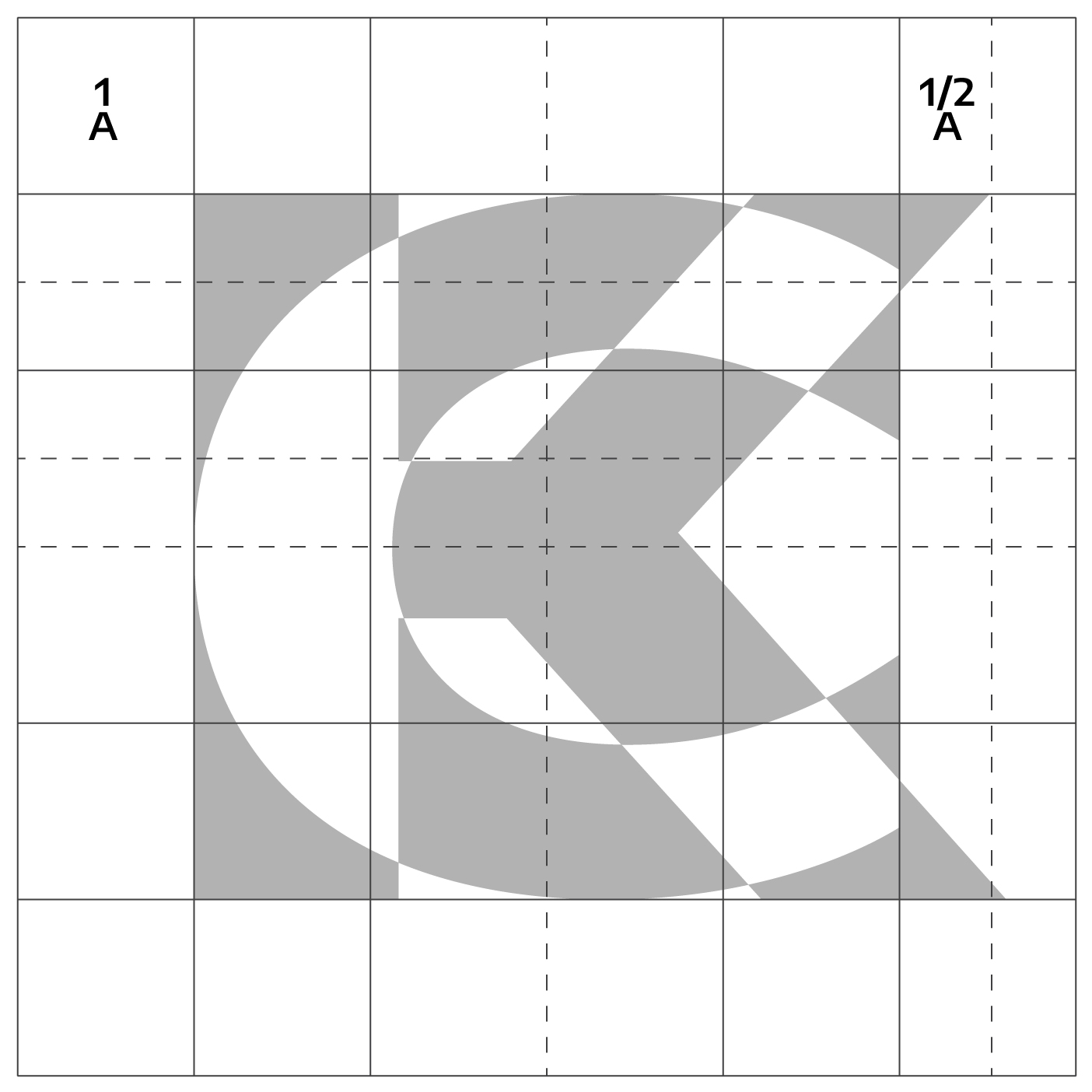
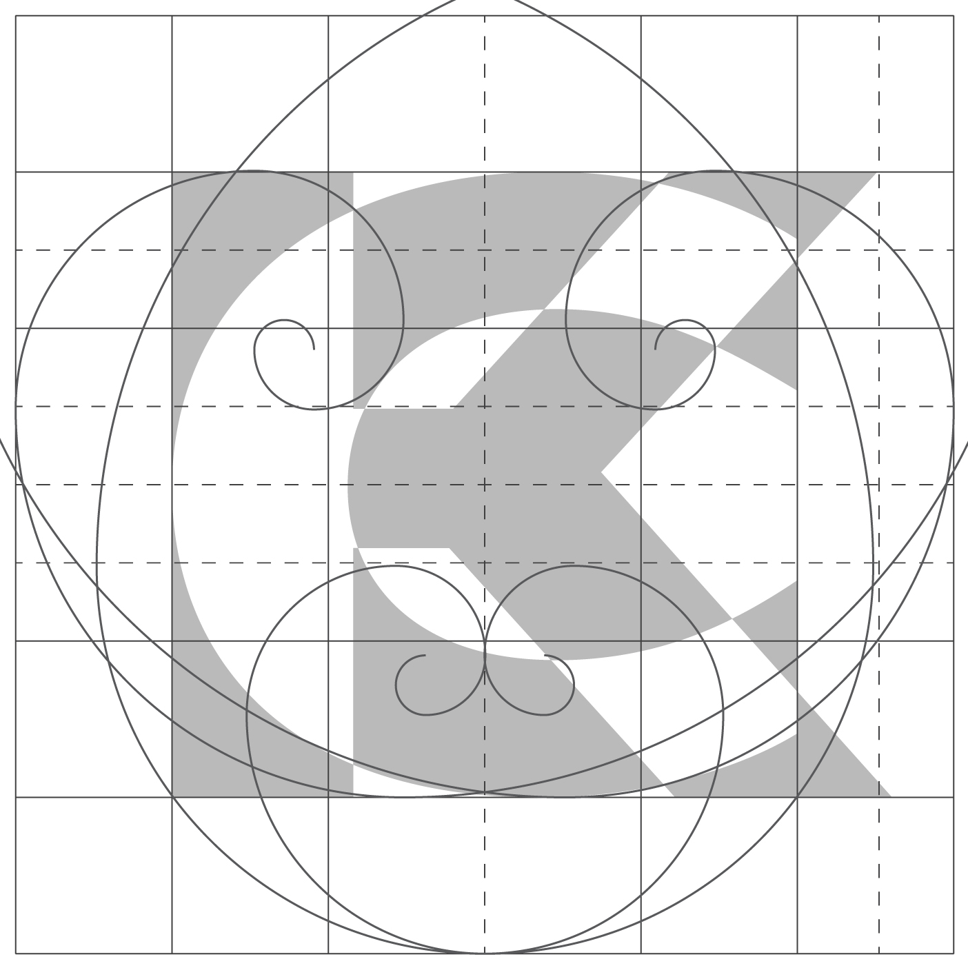
The client required a mark deeply connected to the black-and-white world of Op Art and the geometric patterns characteristic of their mid-century furniture restoration. Given the length of the brand name “Człowiek z Komodo,” a typographic logo would have compromised the desired aesthetic. The goal was to avoid an over-explained design and instead deliver an absolute simplification—a powerful visual anchor that works entirely without letters or written words.
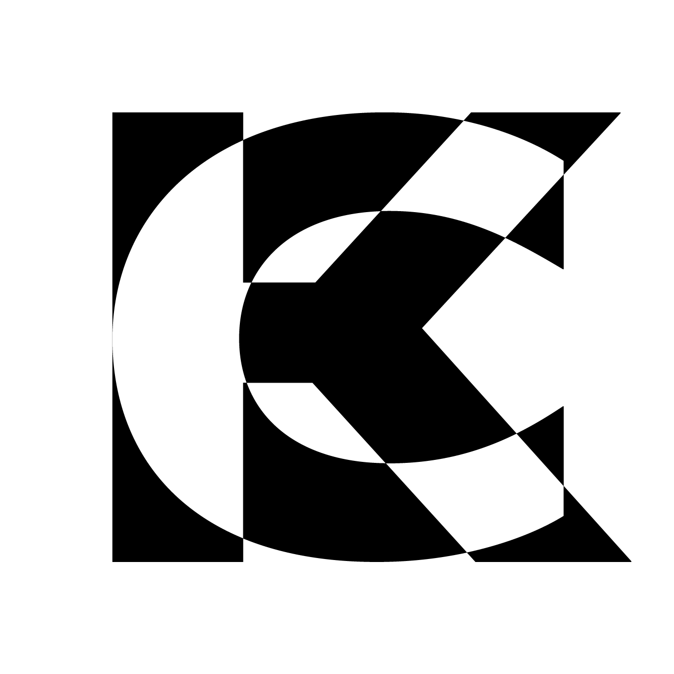
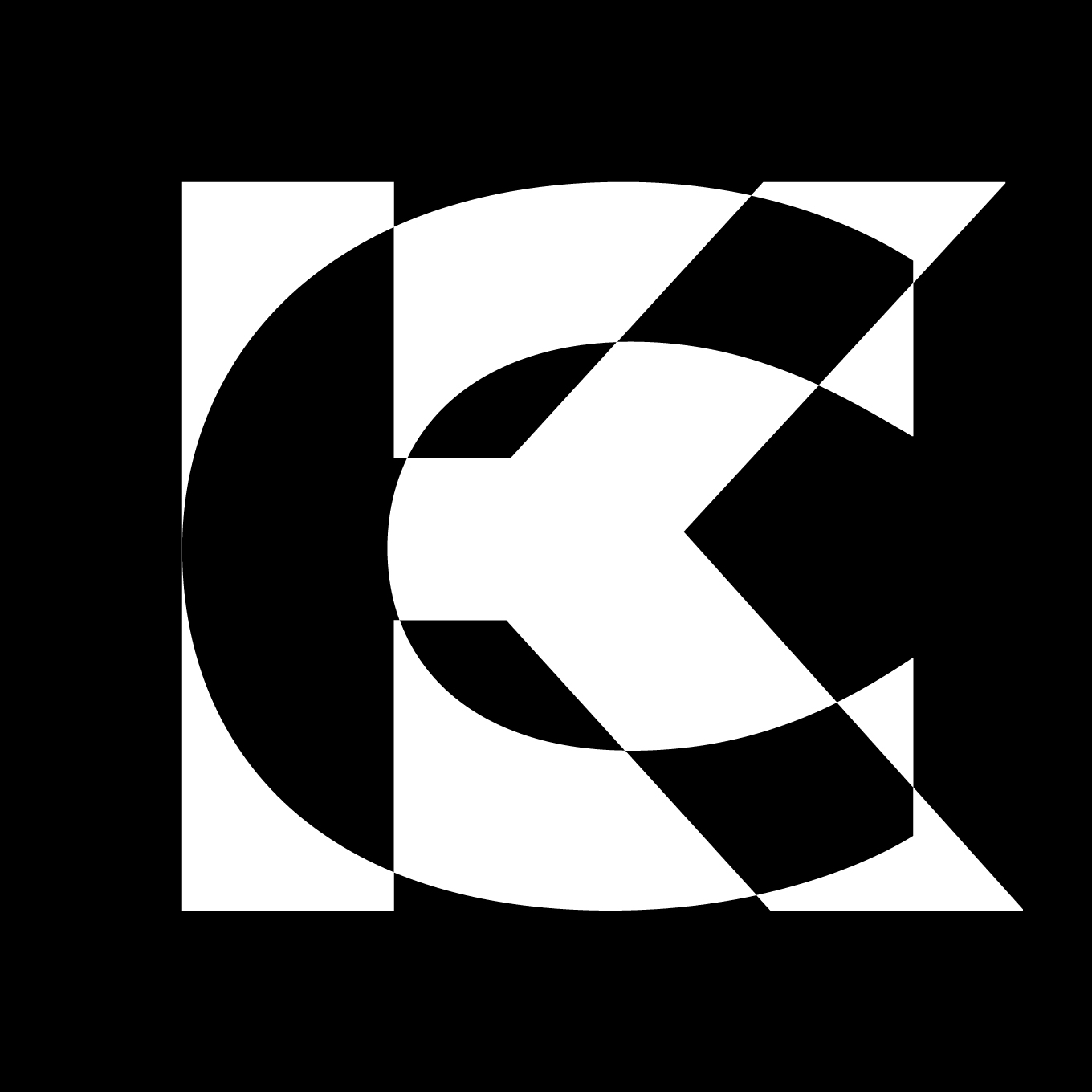
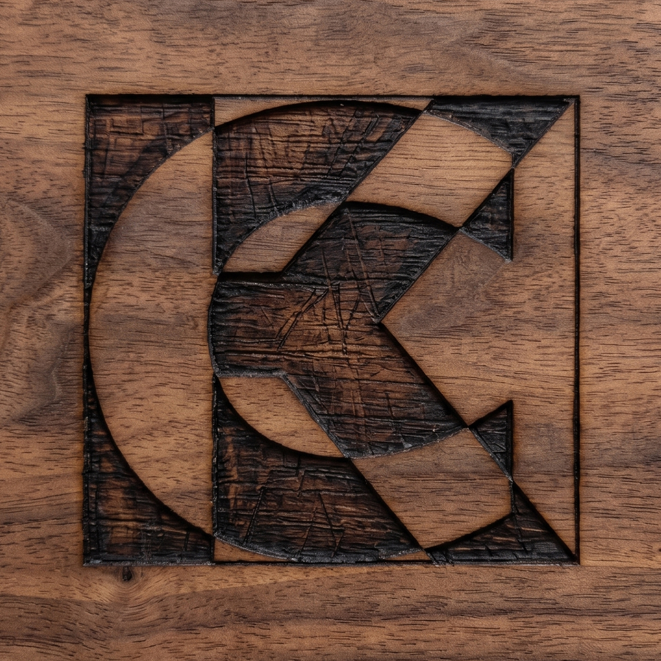
The result is a self-contained square emblem featuring a seamless synthesis of the brand’s core initials, “C” and “K”. By overlapping the two letterforms within a calculated geometric grid, a dynamic interplay of positive and negative space emerged. This black-and-white optical illusion directly mirrors the physical product’s paintwork, successfully merging abstract Op Art thinking with structural, functional identity design.